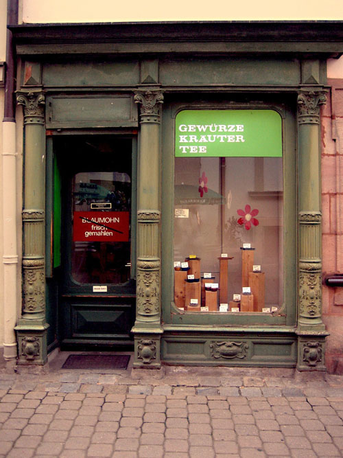
I was looking at Erwin Olaf's works yesterday, and, as is usual when I see something I like, I try to see if I can do it myself. (Remember when I did a sorta kinda Pierre et Gille somewhatta?)
This time I deliberated on how to achieve his signature desaturated colors, digitally. It's his colors, after all, that he is most famous for.
The photo on top is the finished product. I guess it wouldn't be worth showing anyway if I thought I didn't succeed in emulating his colors. It's not exactly perfect yet, but I think I've got the principle.

I guess I'll just have to make it a little bit less reddish, and still a bit less saturated. Oh well.
The photo below is the original. The photo was taken using my Canon powershot digital camera. Boring picture. It's a spice shop, close to the center of city, in the pedestrian zone.
Next step: How do I achieve the same effect using film and traditional darkroom printing? I have an idea, of course, but whether or not I'll have enough interest to actually test that idea remains to be seen.
XXX
P.S.
I started storing some of my blog photos in Flickr. Here's the link.
XXX


No comments:
Post a Comment