Tuesday, July 11, 2006

Pet peeves

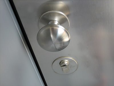
main door lock - photo by Joselito Briones
© Joselito Briones


It's whine time!

I guess by now you already know, no matter how satisfied I am with something, I'd always find a part of it to complain about. Take this apartment for example. As much as I've learned to really like it here, there are still things that annoy me whenever I come into contact with it..

First is the front door lock. Simple - check. Clean - check. Very nice to look at - check. Secure - check. What pisses me off, though, is that the darned thing can't be opened by one hand. Normally, one can use a hand to fish out the key from a pocket, unlock the door, put back the key to the pocket, and then turn the knob with the same hand. This one's different. You'll have to turn the knob with one hand while turning the key with the other. Whenever I come home carrying bags upon bags of grocery, I always end up putting everything down to open the door, pick the things back up, carry them to the kitchen and then go back to the front door to close it. (To put them down again in the entrance hall while closing the door is just too stupid already). So much for German efficiency.

shower control - photo by Joey Briones
© Joselito Briones


Another one is the shower control. It's nice and simple, fine. Looks clean, perfect. Easy to turn on, check. Problem is, it's just as easy to shut off. Imagine yourself taking a shower in a not-so-spacious cubicle. You spend some time adjusting the water temperature, until you get it perfect, exactly the way you want it (it's very important for me, I'm very sensitive to temperature). Then you shower, soap yourself, wiggle, wiggle. Then invariably, a part of your body bumps into the control and shuts it off, or worse, turns it so that the water becomes freezing cold. Then you end up fumbling for the controls to adjust it again, while soap gets in your eyes. Really annoying.

Okay, that's it for now, I'm sure there'd be more in the future.


XXX

Sunday, July 09, 2006

More Fillers

© Joselito Briones


As yesterday, I still don't have anything new to tell you, so here's another flower picture, taken in an empty lot while I was walking about two days ago.

On that same day there was a pottery festival or something, all round the church there were temporary stalls selling all kinds of ceramic things, from useful to kitchy to downright ugly. Too bad the weather wasn't very good, it was raining a bit, there wasn't much people looking around. I saw among the sellers the girl from whom I bought a small pot sometime ago.

© Joselito Briones


XXX

Wednesday, July 05, 2006

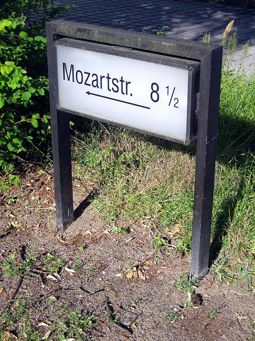
Mozart's 8 1/2

Mozart's 8-1/2 - photo by Joey Briones
© Joselito Briones


I guess it's not uncommon for any country to be dubious of visiting foreigners' ability to assimilate with local vehicular and pedestrian traffic.

In London, it makes sense that they have "Look Left" and "Look Right" signs on pedestrian crossings, as most foreigners visiting the city would probably come from a country with reversed vehicular traffic directions. The problem is, they put the directional sign on the street pavement, on the side of the street where a pedestrian would be crossing from, inches away from where one would be standing just before he crosses the street. Whoever looks in that direction before crossing? To look there would mean to bend your head so much as to disregard the actual direction and situation of the traffic (not what your instinct would tell you to do). The traffic direction written on the other side of the street is much more visible, that's what one sees before crossing the street. Only, that signage points to the opposite direction. And the letters are upside down from the viewpoint of the pedestrians who could see them, adding to the confusion. Obviously, it's a lot more expensive to put the directional signage where they should be, on a pole, where it would be clearly visible, and visible only from one side, from the other side of the street.

street sign in erlangen - photo by Joselito Briones
© Joselito Briones


In Germany, they went one step further. They've got a bigger problem in that there is a big probability that not many visiting foreigners understand the German language. So instead of words, they made graphic representations (photo, left). This one says: "This is a street where you can see an average German family. The man, distinguished as so by the fact that he doesn't have long hair and he's not wearing a dress nor a skirt, is playing football with the son, same gender indication as before, only this one's smaller. The wife, invisible from this illustration, is home, in that two-story house, cooking. This family has a car, and it's not one of those enormous gas-guzzling american cars, either. It's parked right on the street because they use their garage for something else. The hockey stick is for the mother's use, to whack some sense into the father and the son if they become too crazy about football."

When I took this photo, there were several tourists standing in front of the sign, looking at it, while someone, presumably the tour guide, was speaking loudly to everyone in a language I didn't recognize. I could imagine her explaining the signage to the group, "This is the place where a man and his son, bonding and playing football, got run over by a car. At first, the authorities thought it was an accident, but after investigation, they found out that the driver of the car is also the resident of the house they were playing in front of. He got annoyed because of all the noise they're making and decided to run them over. The driver's wife watched the carnage from the window of the house."


XXX

P.S.
The German team lost their bid for the World Championship last night, when they lost the match to Italy. I thought they really did a good job though, and I for one will probably be watching more football from now on.


XXX

Popular Posts